We built lead capture forms directly into Vedain CRM so sales teams can go from form submission to pipeline in seconds, no third-party tools required. Through that work, we've studied hundreds of forms across industries and noticed clear patterns that separate high-performers from the rest. The examples below reflect what we've learned and what top brands are doing right now.
This article breaks down 15 lead capture forms worth copying in 2026, each with a screenshot-level look at what makes it effective, why it converts, and how you can apply the same principles to your own site. Let's get into it.
1. Vedain CRM Embedded Lead Form
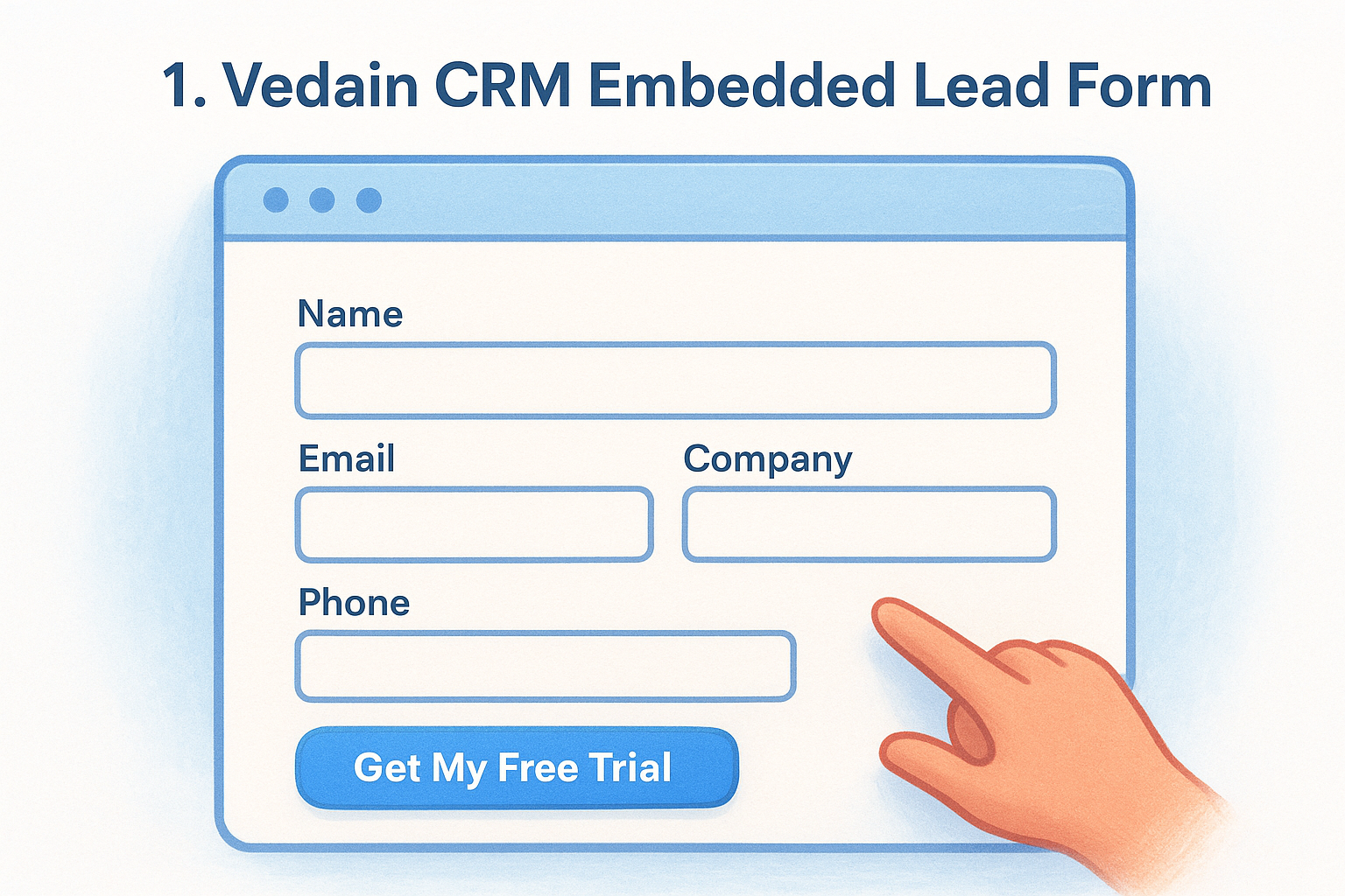
Vedain CRM includes a native lead form builder that lets you embed a conversion-ready form on any website page in under five minutes. Unlike most lead capture form examples you'll find where submissions land in a spreadsheet or a third-party tool, Vedain routes every entry directly into your CRM pipeline, triggering automation rules, assigning leads to reps, and logging contact data without any manual work. The form is clean, branded, and built to reduce friction from the first field to the submit button.
Why It Converts
The embedded form converts well because it asks only what the sales process actually needs at the top of the funnel. The default setup uses three to four fields: name, email, company, and an optional phone number. Every extra field you add lowers your completion rate, so Vedain keeps the default intentionally lean rather than trying to collect everything upfront.
Removing even one unnecessary field from a lead form can lift conversion rates by 25% or more, according to consistent findings across A/B testing research.
Keeping the form embedded inside your existing page layout, rather than redirecting visitors to a new URL, reduces drop-off significantly. The visitor stays inside the same context that convinced them to act in the first place, which builds continuity between your marketing message and the form itself.
Form Layout and Field Strategy to Copy
Vedain's form uses a single-column vertical layout with clear labels positioned above each field, not placeholder text inside the input boxes. Placeholder text disappears the moment someone clicks into a field, which forces the visitor to remember what goes where. Labels above fields eliminate that friction entirely. The submit button uses specific action language like "Get My Free Trial" rather than a generic "Submit," which reinforces the value the visitor receives by completing the form.
Each field also has inline validation that flags errors in real time, so visitors do not fill out the entire form only to face an error wall at the end that sends them back to the top.
Best Use Cases for This Pattern
This form pattern works best when you need qualified leads entering your pipeline immediately without manual data entry or CSV imports. It fits SaaS product pages, pricing pages, and any page where visitors already have some intent to act. If you run outbound follow-up sequences through Vedain's email campaign tools, this form gives your team a clean, automated starting point for every new contact who raises their hand.
2. Figma Demo Request Form
Figma's demo request form is one of the most studied lead capture form examples in the SaaS world, and for good reason. It strips the process down to the minimum information a sales team needs to qualify and book a call, while keeping the ask proportional to the offer. You are not filling out a questionnaire; you are taking one clear step toward a scheduled demo.
Why It Converts
Figma's form converts because it pairs a strong headline with a specific value proposition rather than a vague call to action. The page tells you exactly what happens after you submit: a sales rep will contact you to schedule a walkthrough tailored to your team. Clarity about the next step removes hesitation, which is the number one reason people abandon forms mid-completion.
Visitors who know exactly what happens after they click submit are far more likely to follow through than those left guessing.
Form Layout and Field Strategy to Copy
The form uses five to six fields covering the basics: name, work email, company size, role, and a brief use case selector. Work email specifically filters out low-intent personal accounts, which helps Figma's sales team prioritize outreach. Dropdown menus replace open text fields wherever possible, cutting the cognitive load of typing and making the form feel faster to complete even when the field count looks moderate.
Best Use Cases for This Pattern
This pattern works best for B2B products with a sales-assisted buying process where lead quality matters more than lead volume. If your team books demos as the primary conversion event, using role and company size selectors up front gives your reps context before the first call so no time gets wasted on discovery basics.
3. Twilio Signup Form with SSO
Twilio's signup form stands out among lead capture form examples in the developer tool space because it treats account creation as the conversion event itself, not as a gateway to it. Getting users into the product immediately removes the traditional gap between "interested visitor" and "active user," and that directness is precisely why the form performs so well.
Why It Converts
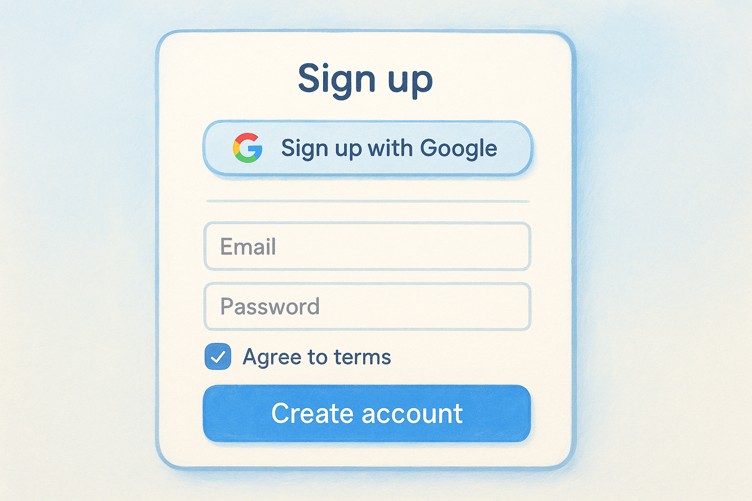
Twilio places SSO options front and center, letting visitors create an account with their Google credentials in a single click. When someone can bypass typing their name, email, and password entirely, the friction cost drops to near zero. Reducing the number of required actions is one of the highest-leverage changes you can make to any signup or lead capture flow.
One-click SSO options consistently outperform traditional email-plus-password forms in signup rate studies across developer-focused products.
Form Layout and Field Strategy to Copy
The form keeps manual entry fields to a minimum for anyone who skips SSO, typically just email and password. Several design choices reinforce this low-friction experience:
- •Visual separator between the SSO button and manual fields confirms both paths reach the same destination
- •Terms checkbox sits below the fields, keeping the top of the form focused on the primary action
- •Specific CTA label makes clear what happens immediately after you click
Best Use Cases for This Pattern
This pattern fits best when your primary audience is technical or relies on Google Workspace as a daily tool. Developers, product managers, and startup founders all expect SSO as a standard option. Pairing it with a minimal manual fallback ensures you capture leads from anyone who prefers typing over connecting an account.
4. Netflix Multi-Step Email Capture
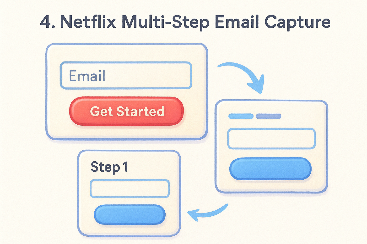
Netflix's approach to lead capture sits at the top of any list of lead capture form examples worth studying because it converts millions of visitors every year using a technique most brands ignore: asking for one thing at a time. Instead of presenting a full signup form upfront, Netflix splits the process into sequential micro-steps that feel easy to start and even easier to finish.
Why It Converts
Netflix opens with a single email field on the homepage, not a full registration form. This matters because the psychological cost of typing one email address is nearly zero compared to filling out five fields at once. Once you submit that email, the perceived commitment has already happened, and completing the remaining steps feels natural rather than burdensome.
A single-field first step lowers the activation threshold enough that visitors who would abandon a full form will often complete a multi-step sequence instead.
Form Layout and Field Strategy to Copy
The flow separates billing, personal details, and plan selection into distinct screens, so each step feels manageable on its own. Visual progress indicators show you exactly how far along you are, which reduces anxiety about how much is left to complete. Each screen has one primary action, keeping your attention focused on finishing that step rather than scanning an overwhelming wall of fields.
Best Use Cases for This Pattern
This pattern fits any product with a longer-than-average registration process that scares visitors away when shown all at once. If you run a subscription service, a SaaS trial, or any offer requiring billing details, breaking the form into three to four sequential steps consistently reduces abandonment without removing any information you actually need.
5. Peloton Free Trial Opt-In
Peloton's free trial form earns its place among the best lead capture form examples because it connects the form directly to an emotional outcome, not just a product feature. The copy focuses on what your life looks like after you start, not what the app does, and that shift in framing makes every field feel worth filling out.
Why It Converts
Peloton leads with a low-commitment offer: a free trial that costs you nothing to start. That framing removes the most common reason visitors bounce from opt-in forms, which is financial hesitation. By positioning the form around a trial rather than a purchase, Peloton lowers the perceived risk of handing over personal information to near zero.
Framing a form around a free or low-risk offer rather than a direct purchase can dramatically reduce the psychological barrier to completing it.
Form Layout and Field Strategy to Copy
The form keeps field count minimal, typically asking for email, name, and basic fitness preferences to personalize the experience. Those preference fields do double duty: they feel like personalization rather than data collection, and they give Peloton's marketing team segmentation data they can use immediately in follow-up sequences. The submit button reinforces the offer with language tied to the trial, not a generic action word.
Best Use Cases for This Pattern
This pattern works best when you offer a free trial or freemium tier as your primary conversion event. If your product has a clear before-and-after transformation, lead with that outcome in your form copy. The preference or qualification fields are especially useful if your follow-up emails depend on knowing something specific about the lead before the first touchpoint.
6. Morning Brew Single-Field Newsletter Form
Morning Brew built one of the most recognizable newsletter brands in media by keeping its lead capture form as simple as physically possible: one field, one button, done. This approach has helped Morning Brew grow to millions of subscribers, and studying it alongside other lead capture form examples reveals a clear lesson about how low-friction design outperforms complex opt-in flows for top-of-funnel content.
Why It Converts
The form works because it asks for the minimum viable commitment: just your email address. No name, no company, no phone number. That single field removes every reason to hesitate, and the surrounding copy does the heavy lifting by explaining exactly what lands in your inbox and how often. Specificity in the value proposition compensates for the lack of qualification fields.
Reducing a form to a single field can double or triple completion rates compared to multi-field alternatives for content-driven offers.
Form Layout and Field Strategy to Copy
Morning Brew places the email field and submit button on the same horizontal row, making the entire form occupy less vertical space than a single paragraph of text. The button copy reads as a clear payoff rather than a generic action, reinforcing what you receive rather than what you give. Social proof in the form of subscriber counts sits immediately adjacent to the form, reducing any remaining uncertainty about whether signing up is worth it.
Best Use Cases for This Pattern
This pattern works best for content-first businesses like newsletters, blogs, and media brands where the content itself is the primary offer. If your audience needs repeated exposure before they commit to a purchase, capturing the email first and nurturing through content gives you a low-pressure entry point that compounds over time.
7. LinkedIn Gated Content Registration
LinkedIn's gated content registration is a standout among B2B lead capture form examples because it connects a high-value asset directly to a frictionless sign-in experience. When LinkedIn promotes whitepapers, research reports, or webinars through its platform, it pre-fills the registration form with data already stored in your LinkedIn profile, turning what would normally be a four-minute task into a four-second one.
Why It Converts
The form converts because it eliminates manual data entry almost entirely for anyone already logged into LinkedIn. Your name, job title, company, and email address populate automatically, which removes the single biggest reason people abandon gated content forms: the effort of typing information they have already given a platform once before. Pre-filled fields feel like permission granted, not information extracted.
Pre-populated form fields can increase completion rates significantly because they shift the visitor's experience from effort to confirmation.
Form Layout and Field Strategy to Copy
LinkedIn keeps the layout to a clean single-column design with clearly labeled pre-filled fields and a prominent download or registration button at the bottom. Visitors only need to confirm their details rather than type them, and the visual confirmation of correct data builds trust before the click. A short privacy note near the submit button reassures visitors about how their information gets used.
Best Use Cases for This Pattern
This pattern works best when you distribute gated assets like reports, guides, or webinar registrations to a professional audience. If your product targets business buyers, pairing gated content with a CRM like Vedain means every confirmed registrant flows directly into your pipeline rather than sitting in a static download list.
8. Deel Multi-Step Demo Request
Deel's demo request form stands out among B2B lead capture form examples because it handles a genuinely complex sales process without overwhelming the visitor. Deel sells global payroll and compliance software to companies of wildly different sizes and needs, so a single generic form would either ask too much or collect too little. Their multi-step approach solves that by gathering progressive information across several short screens, keeping each individual step feeling manageable.
Why It Converts
Deel's form earns strong completion rates because it front-loads the easiest questions first. You start with your work email, which takes two seconds, and only encounter more detailed questions after you have already committed to the first step. That sequence matters because each completed step builds psychological momentum toward finishing the entire flow rather than abandoning it halfway through.
Starting with a low-effort field and working toward more specific questions consistently outperforms forms that lead with complex or sensitive asks.
Form Layout and Field Strategy to Copy
The form uses conditional logic to show relevant follow-up fields based on your earlier answers, so a company with 10 employees sees different questions than one with 500. This keeps the total number of visible fields low for every visitor while still collecting the segment-specific data Deel's sales team needs to personalize the demo. Each screen uses a single-column layout with one clear action button per step.
Best Use Cases for This Pattern
This pattern fits products with multiple distinct buyer segments that require different sales conversations. If your demo process changes depending on company size, industry, or use case, conditional multi-step forms let you collect that information without building separate landing pages for each audience type.
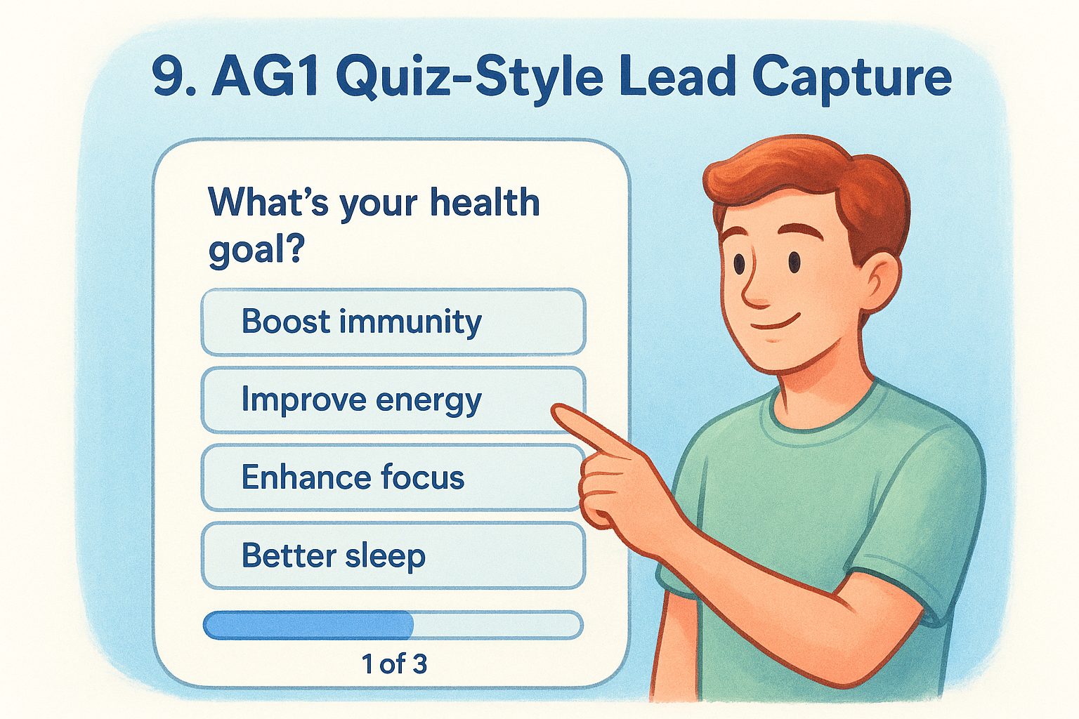
9. AG1 Quiz-Style Lead Capture
AG1 built one of the most compelling quiz-style lead capture form examples in the direct-to-consumer health space by turning the lead capture process into a personalized recommendation engine. Before AG1 ever asks for your email address, it walks you through a short series of questions about your health goals, lifestyle, and daily habits. By the time the email field appears, you feel like you have already invested in the process.
Why It Converts
The quiz works because it reframes data collection as value delivery. You are not filling out a marketing form; you are answering questions that will shape a product recommendation built specifically for you. That psychological shift turns a form that might otherwise feel like a barrier into something that feels like a service.
When visitors perceive a form as helping them rather than extracting from them, completion rates climb sharply compared to standard opt-in flows.
Form Layout and Field Strategy to Copy
AG1 uses multiple-choice question screens with one question per step, so the quiz never feels like a wall of text. Each answer requires a single click rather than typing, which keeps the interaction fast and low-effort. Progress indicators show exactly how many steps remain, reducing the uncertainty that causes mid-quiz abandonment.
Best Use Cases for This Pattern
This pattern works best for products with a clear personalization angle, including supplements, fitness tools, skincare, and software with multiple use-case tracks. If your product fits different buyer profiles, a quiz gives your follow-up email sequences the context they need to send relevant content from the first message rather than starting with generic onboarding copy.
10. Modsy Long Form Split Into Steps
Modsy offered personalized interior design services online, which meant their lead capture process had to collect far more information than a typical SaaS signup. Room dimensions, style preferences, budget ranges, and photo uploads all had to happen before a designer could start work. Rather than placing all of that on a single page, Modsy split the entire intake process into sequential steps, turning what would have felt like a survey into something closer to a conversation. Among complex multi-step lead capture form examples, Modsy's approach shows how to handle genuinely demanding data collection without losing visitors before they finish.
Why It Converts
Visitors complete Modsy's form at high rates because it segments a large ask into small, achievable pieces. Each step covers one topic only, so no single screen ever feels overwhelming. The progress bar at the top of each step shows how far you have come and how little remains, which sustains momentum even when the total field count is significant.
Showing visible progress through a long form reduces abandonment because visitors feel the finish line getting closer with every completed step.
Form Layout and Field Strategy to Copy
The form uses visual selection cards instead of text dropdowns wherever possible, letting you choose style preferences by clicking on images rather than reading through a list. This makes each step feel interactive rather than administrative, which keeps engagement higher across the full sequence.
Best Use Cases for This Pattern
This pattern suits any service business that needs detailed intake information before delivering a quote or starting work. If your sales process depends on understanding scope, budget, and preferences upfront, splitting that intake across five to seven short steps keeps your completion rate far higher than a single long-scroll page would.
11. Basepaws Exit-Intent Offer Form
Basepaws sells cat DNA tests and wellness reports directly to pet owners, making them a strong reference point for studying exit-intent lead capture form examples in the direct-to-consumer space. Their exit-intent form appears the moment a visitor's cursor moves toward the browser's close button or back arrow, presenting a time-sensitive discount offer before that potential customer disappears entirely.
Why It Converts
The form converts because it intercepts visitors at exactly the right moment: when they have shown enough interest to browse but have not yet committed to a purchase. Exit-intent timing targets visitors who already know the product exists, which means the barrier to conversion is much lower than it would be for a cold visitor seeing the brand for the first time.
Catching a warm visitor before they leave consistently outperforms trying to re-engage that same visitor through retargeting ads after they have already gone.
Form Layout and Field Strategy to Copy
Basepaws keeps the form to a single email field paired with a clear discount offer, such as a specific percentage off the first order. The headline leads with the exact dollar or percentage value rather than vague language, so visitors immediately understand what they gain by staying. A short one-line privacy note beneath the field reassures visitors their email will not be sold or shared with third parties.
Best Use Cases for This Pattern
This pattern works best for direct-to-consumer and e-commerce brands where purchase intent is high but cart abandonment is a consistent problem. If you sell a product with a clear price point, pairing an exit-intent trigger with a first-order discount gives hesitant buyers the push they need without requiring a full redesign of your main page layout.
12. Shark Refer-a-Friend Lead Form
Shark, the appliance brand behind vacuums, air purifiers, and hair tools, uses a refer-a-friend form as one of the more creative lead capture form examples in e-commerce. The mechanic is straightforward: existing customers share a link or enter a friend's email directly through a branded referral form, and both parties receive a discount when the friend makes a purchase. That mutual reward structure does the acquisition work before your marketing team gets involved.
Why It Converts
The refer-a-friend form converts because it transfers trust from an existing customer to a new lead before any brand messaging ever reaches them. A recommendation from someone you know carries more weight than any ad or email campaign, which means the leads arriving through this form are pre-qualified by social proof rather than cold interest. Shark captures that warm intent at exactly the right moment by making the referral process as simple as entering an email address.
Word-of-mouth referrals consistently convert at higher rates than other acquisition channels because trust has already been established before the lead first encounters your form.
Form Layout and Field Strategy to Copy
The form keeps the field count to two: the referring customer's email and the friend's email. Clear instructional copy explains what each party receives, so the value is obvious before anyone clicks submit. Confirmation messaging appears immediately after submission, reinforcing that the discount is on its way and reducing any post-submission doubt about whether the referral registered correctly.
Best Use Cases for This Pattern
This pattern works best for direct-to-consumer brands with repeat buyers who already feel loyal to the product. If your customers genuinely like what they purchased, a refer-a-friend form gives them a structured way to share that satisfaction while growing your contact list with leads who arrive already warm.
13. Medium Returning-Visitor Prompt
Medium's returning-visitor prompt earns its spot among behavioral lead capture form examples because it triggers based on what a visitor does rather than how long they have been on the page. After a reader consumes a set number of free articles, Medium presents a targeted prompt asking them to sign in or create a free account to keep reading. That timing is everything.
Why It Converts
Medium's prompt converts because it appears at the exact moment a reader has already demonstrated high intent through repeated behavior. Someone who has read three articles is far more motivated to sign up than a first-time visitor who just landed on the homepage. The form targets readers who are already bought in, which means the conversion barrier is significantly lower than any cold opt-in placement would face.
Behavioral triggers that activate based on prior engagement consistently outperform time-based or scroll-based triggers because they catch visitors at peak motivation.
Form Layout and Field Strategy to Copy
Medium keeps the prompt minimal: a single call-to-action screen with Google SSO, Apple sign-in, and an email option below. The copy reminds you of the value you have already received and what you gain by continuing, framing the account creation as continuation rather than interruption. No fields require typing unless you skip both SSO options.
Best Use Cases for This Pattern
This pattern works best for content-driven platforms and media sites that offer a limited number of free interactions before asking visitors to register. If your product includes a content library, free tool, or resource hub, gating access after several successful uses gives you a natural, non-aggressive moment to capture the lead.
14. Marie Forleo Popup and Cracku Urgency Form
Marie Forleo and Cracku represent two distinct approaches to urgency-driven lead capture form examples, but both use the same core mechanic: they give you a specific reason to act now rather than later. Marie Forleo, a business and life coach, deploys a popup offering a free training or guide to first-time visitors. Cracku, an Indian test prep platform, adds a countdown timer directly to its lead capture form, showing you exactly how many minutes remain before a discount or free resource expires.
Why It Converts
Urgency works in these forms because it removes the option to delay. Most visitors who leave a page without converting do not come back. A countdown timer or limited-time offer copy forces a real decision in the moment rather than letting hesitation push the choice to a future visit that never happens.
Time-limited offers convert higher than open-ended ones because they shift the default from "maybe later" to "decide now."
Form Layout and Field Strategy to Copy
Marie Forleo's popup uses a single email field with benefit-focused headline copy that ties directly to the free resource on offer. Cracku places the countdown timer directly above the submit button, making the urgency visual and impossible to miss. Both forms limit field count to one or two inputs, which keeps the conversion cost low even when the emotional pressure is high.
Best Use Cases for This Pattern
This pattern fits webinar registrations, limited-seat offers, and time-sensitive content downloads where genuine scarcity exists. If your offer has a real deadline, show it clearly on the form itself rather than only in the surrounding page copy.
Next Steps
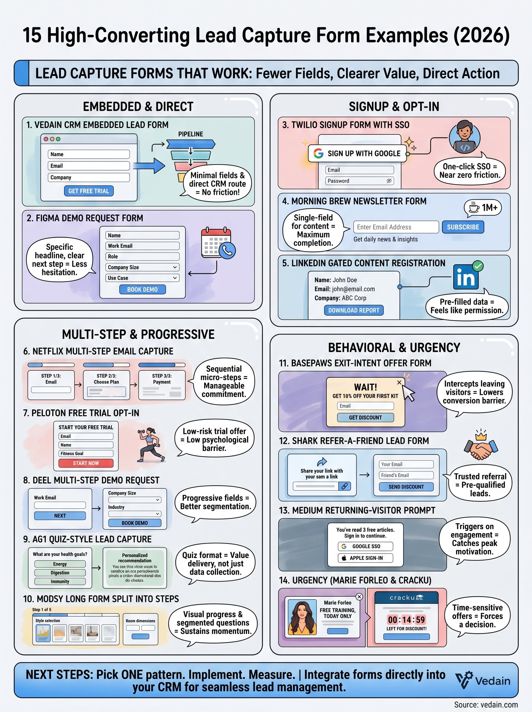
Every lead capture form example in this list points to the same conclusion: fewer fields, clearer value, and a direct line from submission to action. You do not need to redesign every form at once. Pick one pattern from this list that matches your current conversion goal, implement it, and measure the result before moving to the next.
If you want to skip the third-party form tools entirely, Vedain CRM's built-in lead forms connect each submission directly to your sales pipeline, trigger automation workflows, and assign leads to reps without any manual steps in between. Setup takes under five minutes, and every contact flows into the same system your team already uses to manage deals and track outreach. That connection between capture and follow-up is where most teams lose leads, and it is the easiest gap to close.